Gwent Marmot Region: Branding Development Journey
Developed by Scott Wilson-Evans, Strategic Head of Communications, Aneurin Bevan University Health Board.
See Scott talk through the journey here:
The Ambition
To create a brand identity that can inspire a movement to drive change together as a full system to reduce inequalities and support communities across Gwent to live well and live long. The branding development was included as a recommendation of action in the Gwent PSB Marmot Update Paper on September 29th under Item 5 to the Gwent PSB Board.
The Requirement
The creation of a logo, tagline, colour palette and supporting digital / offline assets for use across the Marmot Programme work for partners.
A procurement exercise was carried out by the Strategic Head of Communications for Population Health and the Marmot Leadership Group and Orchard was appointed as the design agency to deliver this ambition.
The Journey
In creating the brand identity, the following list of areas were created and tested within the focus groups:
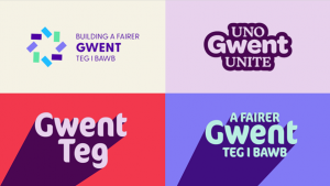
An initial 4 concepts were created and tested with community groups. Following the feedback from those sessions, tweaks were made the preferred two concepts were then taken to professional stakeholders.
Working Together
Becoming a Marmot Region is a collaborative approach, and creating its brand should be no different. With the Marmot Region work impacting future generations, Gwent Communities and partners focus groups and feedback sessions were delivered by the agency and Marmot Leadership Group to coproduce the brand identity.
Focus Groups were held with:
Professional Feedback
The End Result
Feedback from the young people and the community focus group was that the younger branding was preferred, and at the professional event, partners preferred the more corporate brand.
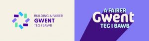
Based on the key elements that people liked about the two concepts a final concept was produced, by taking the corporate options, softening the building blocks to make them less corporate as well as amending the central font to give it a more inclusive feel.
This concept is now finalised and recommended for use.
For Note:
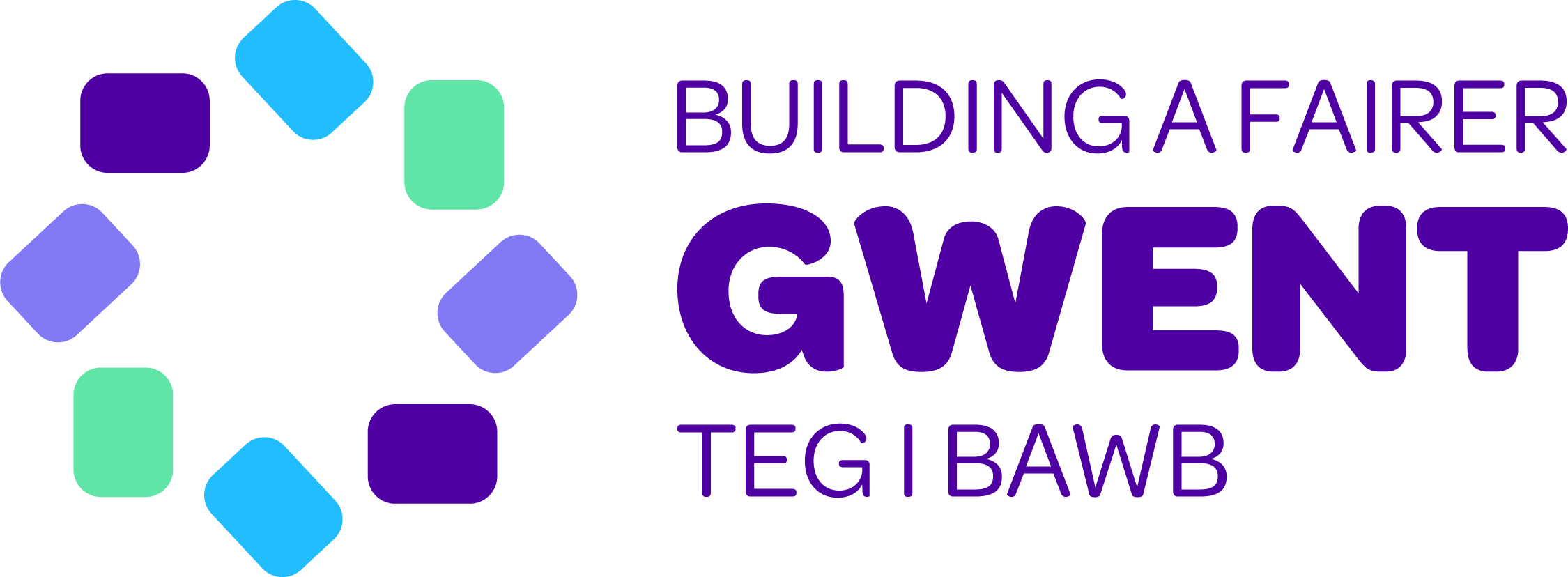
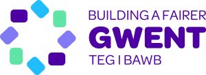
In the logo the 8 rounded boxes represent the 8 Marmot principles, arranged in a star to show collaboration. The Central point is Gwent in the logo and is arranged to work bilingually following Welsh Language advice.
Longevity Note:
As the Gwent PSB agenda continues to develop this brand can flex for use. For example ‘Building a Fairer Gwent’ can suit other priorities such as ‘Building a Safer Gwent’ , ‘Building a Happier Gwent’ ‘Building a More Active Gwent’ ETC.